The brief
Make the first call easier.
Clients often do not know which area of law their problem falls into or what to prepare. The site guides them: pick an area, see the documents to bring and the questions the lawyer will ask, then book.
Website / Legal / Concept
A composed law-firm website for Banja Luka where a case file fills, gets stamped and signed as you scroll.
Project overview
Marković & partneri is a concept website for a law firm in Banja Luka covering commercial law and company formation, real estate and contracts, family and inheritance, employment, debt collection and criminal defence. Navy, cream, oxblood and gold with Newsreader set a serious but approachable tone. The pinned 'from first meeting to resolution' section fills a case file across five phases: lines are drawn, documents are checked, a strategy route appears, then a stamp and a hand-drawn signature land while a gold scale of justice comes into balance.
The goal was to make the offer easier to understand, present the work with stronger context and create a smoother path from first impression to contact, inquiry, booking or product evaluation.
A closer look
Open any image for a full-screen preview.
Case study
People contact a lawyer when something is already wrong. The concept lowers the stress: it shows how a case moves, what to bring to the first meeting and what it will roughly involve, and it keeps the firm's tone calm and precise.
Trust and performance signals
5
Case phases
Consultation, analysis, strategy, representation and resolution in one pinned case file.
6
Practice areas
Each with typical matters and a checklist of documents to bring.
100
Desktop Lighthouse
96 on mobile, 100 for accessibility, best practices and SEO.
The thinking behind the work
The brief
Clients often do not know which area of law their problem falls into or what to prepare. The site guides them: pick an area, see the documents to bring and the questions the lawyer will ask, then book.
Design direction
Newsreader with italic accents for headings, Instrument Sans for text and Geist Mono for file details. Lawyers are shown as monograms instead of stock portraits of people.
Responsibility
The footer states that the content is informational and not legal advice, and that the firm, names and contact details are a demo. The booking form asks for the area, a short description and a preferred time, then opens Viber or WhatsApp.
How it works
01
Map practice areas, documents and first-meeting questions.
02
Case file, stamp, signature and scale as SVG paths.
03
Pinned five-phase file with path drawing.
04
Area checklist that prefills a three-step request.
Design assets
Deliverables
Website
Concept & copy (sr)
UX/UI Design
GSAP motion
SVG illustration
Booking flow
Build something similar
Send a short message about your business, market, current site and goal. Panic Digital can help define the structure, design, development and SEO foundation for the next step.
Contact Panic Digital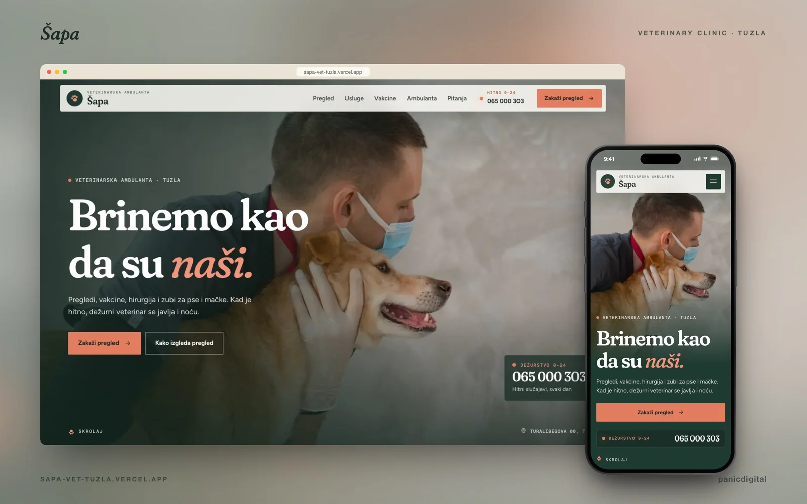
Continue exploring
+A warm veterinary-clinic website for Tuzla that walks through a first check-up, nose to tail.
View next caseRelated project pages