The brief
A clinic that explains before it treats.
Patients search for implants and painless treatment. The page answers the big question first, how an implant actually works, then shows the full range of services and a clear first-visit path.
Website / Health / Concept
A calm dental-clinic website for Sarajevo that builds an implant step by step in a pinned cross-section.
Project overview
Dental centar Osmijeh is a concept website for a dental clinic in Sarajevo. Mint, deep teal and a soft coral with Outfit headlines keep it friendly and clinical at once. The key section is a pinned cross-section of the jaw where an implant is planned, placed, integrates with the bone, receives an abutment and finally a crown. Eight services, a three-step first visit, the clinic, children's dentistry, aesthetics, the team, an FAQ and booking follow.
The goal was to make the offer easier to understand, present the work with stronger context and create a smoother path from first impression to contact, inquiry, booking or product evaluation.
A closer look
Open any image for a full-screen preview.
Case study
Fear and unclear costs keep people away from the dentist. The concept explains first and sells second: what happens during treatment, in what order and how long it takes, with a plain promise of no hidden items.
Trust and performance signals
5
Implant stages
3D scan, placement, osseointegration, abutment and crown in one pinned SVG.
8
Services
Prevention, fillings, endodontics, implants, prosthetics, aesthetics, kids, X-ray and 3D.
98
Desktop Lighthouse
99 on mobile. 100 for accessibility, best practices and SEO.
The thinking behind the work
The brief
Patients search for implants and painless treatment. The page answers the big question first, how an implant actually works, then shows the full range of services and a clear first-visit path.
Design direction
Outfit headlines with a highlighted keyword, DM Sans for text. Light mint backgrounds and white cards keep it clean; coral is used sparingly for children's dentistry.
Booking
Three steps prepare a WhatsApp or Viber message; phone and opening hours sit next to the form, and a sticky bar keeps booking visible on mobile.
How it works
01
List treatments and the questions patients ask most.
02
Draw the jaw, bone, gum, implant and crown as layered SVG.
03
Pinned implant build with progress ring and months.
04
Three-step request, sticky mobile actions.
Design assets
Deliverables
Website
Concept & copy (sr)
UX/UI Design
GSAP motion
SVG illustration
Booking flow
Build something similar
Send a short message about your business, market, current site and goal. Panic Digital can help define the structure, design, development and SEO foundation for the next step.
Contact Panic Digital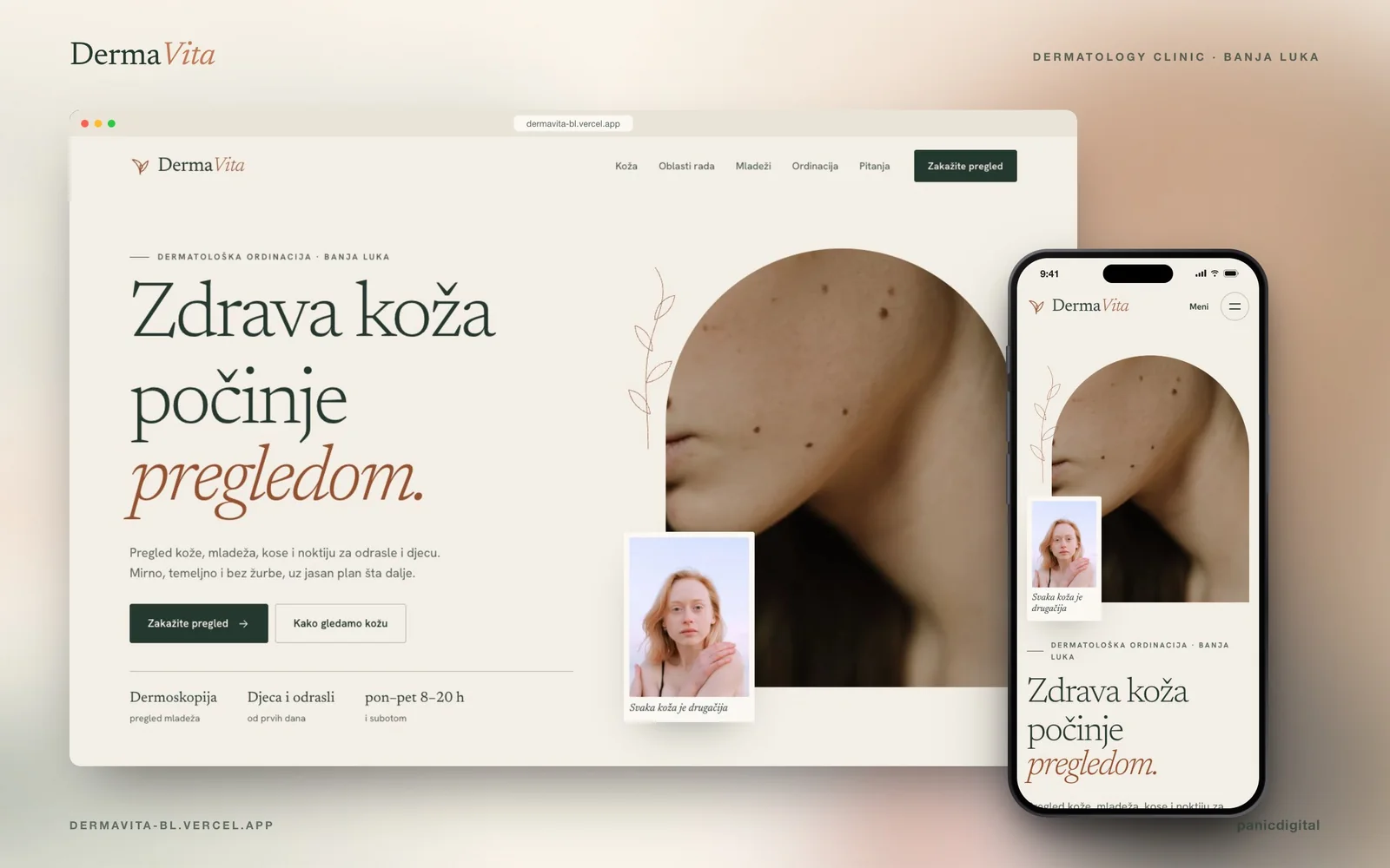
Continue exploring
+A dermatology-clinic website for Banja Luka with pinned skin layers, a dermatoscope lens and ABCDE mole-check cards.
View next caseRelated project pages