All projectsProject / 28

Website / Health / Concept

DermaVita

A dermatology-clinic website for Banja Luka with pinned skin layers, a dermatoscope lens and ABCDE mole-check cards.

WebsiteConcept & copy (sr)UX/UI DesignGSAP motionSVG illustrationBooking flow
Client / Project
DermaVita (concept)
Focus
Website / Concept & copy (sr)
Location
Banja Luka, Bosnia and Herzegovina

Project overview

A focused digital project built for clarity, trust and action.

DermaVita is a concept website for a dermatology practice in Banja Luka. Newsreader serif, forest green, clay and sage give it a calm, medical-editorial tone. A pinned section peels back the skin into epidermis, dermis and hypodermis while a dermatoscope lens moves across, then the ABCDE rule for checking moles is explained in stacked cards. Services, the practice, the first visit, an FAQ and booking follow.

The goal was to make the offer easier to understand, present the work with stronger context and create a smoother path from first impression to contact, inquiry, booking or product evaluation.
Case study

Healthy skin starts with an examination.

Client
DermaVita (concept)
Location
Banja Luka, Bosnia and Herzegovina

Dermatology is part medicine, part reassurance. The concept teaches before it books: what lies under the surface of the skin, what to watch for in a mole and what a first visit looks like.

Trust and performance signals

4

Skin layers

Epidermis, dermis, hypodermis and dermoscopy in one pinned illustration.

5

ABCDE cards

Asymmetry, border, colour, diameter and evolution, each with an example photo.

99

Desktop Lighthouse

90 on mobile. 100 for accessibility, best practices and SEO.

The thinking behind the work

The brief

Educate first, then invite.

Most people book a dermatologist because of a mole, acne or a rash. The site gives them useful knowledge, like the ABCDE rule, and a clear, calm path to an appointment, while stating that the content does not replace an examination.

Design direction

Newsreader, forest green, clay and sage.

Newsreader with italic clay accents for headings, Hanken Grotesk for text. Linen backgrounds with deep green sections feel natural rather than clinical.

  • Pinned skin cross-section with a dermatoscope lens that magnifies on scroll.
  • Stacked ABCDE mole-check cards with large serif letters.
  • Eight service areas from moles to scalp, aesthetic and children's dermatology.

Booking

Reason, time, contact.

Three steps prepare a WhatsApp or Viber message with the reason for the visit. Phone, address and opening hours sit beside it.

How it works

A clear process from the first step to the result.

  1. 01

    Content

    Turn common skin questions into short, careful copy.

  2. 02

    Illustration

    Draw skin layers, follicles and the lens as SVG.

  3. 03

    Motion

    Pinned layers, lens magnification and stacked cards.

  4. 04

    Booking

    Three-step request with a clear medical disclaimer.

Design assets

The visual system behind the project.

Brand system

Deliverables

What was included in the build.

Website

Concept & copy (sr)

UX/UI Design

GSAP motion

SVG illustration

Booking flow

Build something similar

Need a website, web app or redesign with this level of clarity?

Send a short message about your business, market, current site and goal. Panic Digital can help define the structure, design, development and SEO foundation for the next step.

Contact Panic Digital
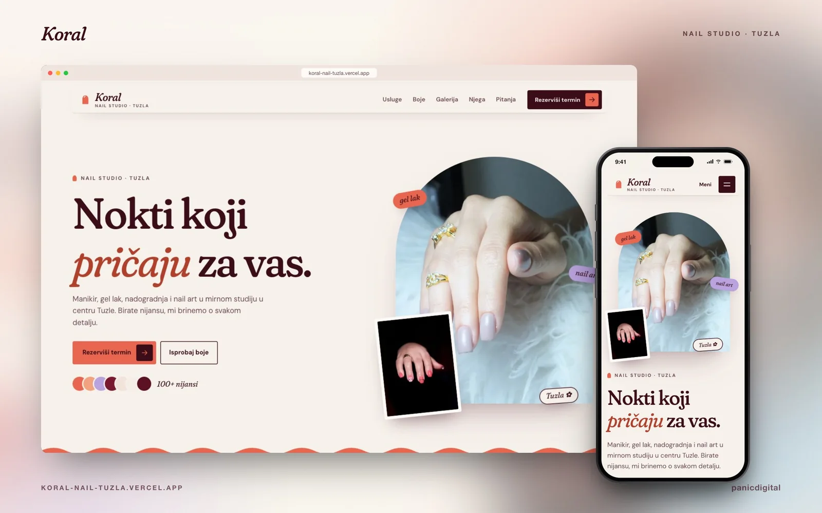
Koral Nail Studio project preview
Next project

Continue exploring

+

Koral Nail Studio

A cheerful nail-studio website for Tuzla where a brush paints the nails on scroll and tapping a swatch repaints the hand.

View next case