All projectsProject / 21

Website / Craft / Concept

A. Diener Schreinerei

A quiet, premium website for a Swiss joinery in Au ZH: custom kitchens, interiors and furniture made to measure.

WebsiteConcept & copy (de-CH)UX/UI DesignMotion designPrivacy & consentPerformance SEO
Client / Project
A. Diener Schreinerei (concept)
Focus
Website / Concept & copy (de-CH)
Location
Au ZH, Switzerland

Project overview

A focused digital project built for clarity, trust and action.

A. Diener Schreinerei is a concept website for a joinery workshop in Au ZH on Lake Zurich, written in Swiss German. It opens with a workshop film and three words, 'Handwerk. Raum. Präzision.', then presents custom kitchens, interior fittings, furniture and renovations, a set of projects around the lake, a horizontal gallery of materials and details, a four-step process, an FAQ and a short project request.

The goal was to make the offer easier to understand, present the work with stronger context and create a smoother path from first impression to contact, inquiry, booking or product evaluation.
Case study

Craft. Space. Precision.

Client
A. Diener Schreinerei (concept)
Location
Au ZH, Switzerland

Swiss clients expect restraint and precision, from the joinery and from its website. The concept keeps the interface almost silent so wood, light and proportions do the talking, and makes the first project request as simple as describing the room.

Trust and performance signals

4

Core services

Kitchens made to measure, interior fittings, furniture and renovations.

3

Featured projects

A Zürichsee kitchen, a living room in Horgen and a built-in in Wädenswil.

4

Process steps

Consultation and measuring, design and materials, workshop production, fitting and handover.

The thinking behind the work

The brief

A joinery website that feels as well made as the furniture.

The audience is homeowners and architects around Lake Zurich. They want to see quality of detail and understand how a commission works, so the copy is calm Swiss German and every section answers a practical question.

Design direction

Paper, olive and forest green with a light grotesque.

Large Manrope headlines with very tight tracking and DM Sans for text. Warm paper backgrounds, a deep forest green section and rounded image cards keep it soft and architectural.

  • Hero film with a pause control.
  • Stacked service cards and a 'one detail per swipe' horizontal gallery: surfaces, storage, hardware and transitions.
  • Second stack on construction, material combinations and on-site fitting.

Privacy & contact

Swiss-style consent, direct contact.

Only necessary storage by default; the OpenStreetMap embed loads after consent. The project request asks for project type, place, timeframe and a short description, with phone and e-mail shown alongside.

How it works

A clear process from the first step to the result.

  1. 01

    Listening

    Translate the workshop's values into short Swiss German copy.

  2. 02

    Design

    Paper tones, olive accents and photography-led layouts.

  3. 03

    Motion

    Stacked cards, horizontal detail gallery and gentle reveals.

  4. 04

    Details

    Consent banner, FAQ, opening hours and a simple project request.

Design assets

The visual system behind the project.

Brand system

Deliverables

What was included in the build.

Website

Concept & copy (de-CH)

UX/UI Design

Motion design

Privacy & consent

Performance SEO

Build something similar

Need a website, web app or redesign with this level of clarity?

Send a short message about your business, market, current site and goal. Panic Digital can help define the structure, design, development and SEO foundation for the next step.

Contact Panic Digital
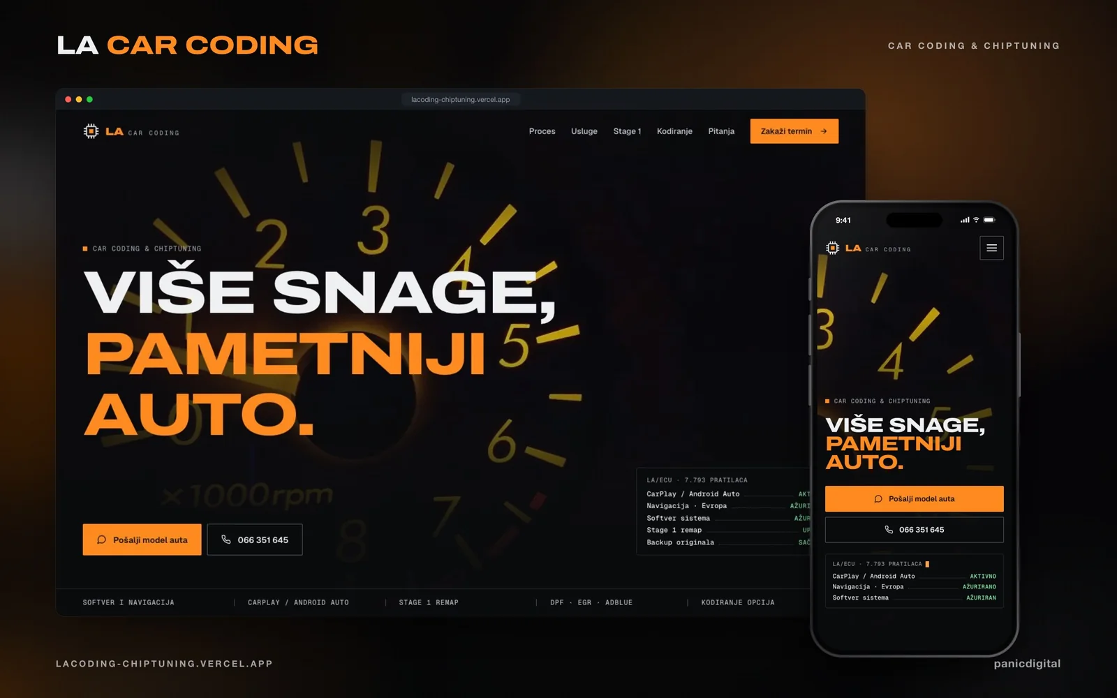
LA Car Coding project preview
Next project

Continue exploring

+

LA Car Coding

A dark, amber-lit website for car coding and chiptuning, with a working in-car screen built in HTML and SVG.

View next case