Alle ProjekteProjekt / 15

Website / Real estate / Concept

Plinth Property

An editorial website for an independent London property advisory: listings, buying, selling and lettings, and plain-language advice.

WebsiteConcept & copy (en-GB)UX/UI DesignMotion designPerformance SEO
Kunde / Projekt
Plinth Property (concept)
Fokus
Website / Concept & copy (en-GB)
Standort
London, United Kingdom

Projektüberblick

Ein fokussiertes Digitalprojekt für Klarheit, Vertrauen und Handlung.

Plinth Property is a concept website for an independent property advisory in London. It opens with a full-bleed photo and one line, 'Find Your Next Move', then explains the approach in three pinned statements, presents a small edit of homes, and splits services into buying, selling and lettings. A journal, an FAQ written without jargon and a clear contact close the page.

Ziel war es, das Angebot verständlicher zu machen, die Arbeit mit mehr Kontext zu zeigen und den Weg vom ersten Eindruck bis zu Kontakt, Anfrage, Buchung oder Kaufentscheidung zu vereinfachen.
Case Study

Exceptional homes. Straight advice.

Kunde
Plinth Property (concept)
Standort
London, United Kingdom

Most estate agent websites are search portals with a logo. This concept sells the advisor instead: a calm, editorial site that explains how decisions get made and makes one experienced person the reason to get in touch.

Vertrauen und Performance

3

Services

Buy, sell and let, each with its own full-bleed card and a short promise.

3

Steps

Tell us what matters, see the market without the theatre, negotiate and complete.

5

Plain answers

Areas covered, off-market sourcing, fees, the process after an offer and management after completion.

Die Überlegungen hinter dem Projekt

The brief

Make advice the product, not the listings.

The audience is buyers, sellers and landlords who already use the big portals. What they lack is judgement, so the copy talks about timing, trade-offs and what not to buy, in British English and without property jargon.

Design direction

One typeface, big photography, soft accent colours.

Everything is set in Inter Tight with tight tracking and grey second lines. Sky, peach and lime appear only in small tags, so the architecture photos carry the page.

  • Pinned three-step 'Property, reframed' section on a dark background.
  • Curated listings with price, location and size, plus large Buy, Sell and Let cards.
  • Support after the keys, a journal and an FAQ that answers fees and off-market questions.

Details

Built like a real agency site.

A cookie banner with real preferences, a contact strip with e-mail and phone, and a footer marked as a concept demo. The structure is ready to take real listings and articles.

So funktioniert es

Ein klarer Prozess vom ersten Schritt bis zum Ergebnis.

  1. 01

    Positioning

    Independent advisor first, listings second.

  2. 02

    Copy

    Short, plain British English for every section and FAQ.

  3. 03

    Design

    Editorial grid, full-bleed photography and a single typeface.

  4. 04

    Build

    Pinned statements, carousel, consent banner and responsive QA.

Design-Assets

Das visuelle System hinter dem Projekt.

Brand system

Leistungen

Was im Projekt enthalten war.

Website

Concept & copy (en-GB)

UX/UI Design

Motion design

Performance SEO

Etwas Ähnliches bauen

Sie brauchen eine Website, Web-App oder ein Redesign mit dieser Klarheit?

Schicken Sie eine kurze Nachricht zu Ihrem Unternehmen, Markt, Ihrer aktuellen Website und Ihrem Ziel. Panic Digital hilft bei Struktur, Design, Entwicklung und SEO-Grundlage für den nächsten Schritt.

Panic Digital kontaktieren
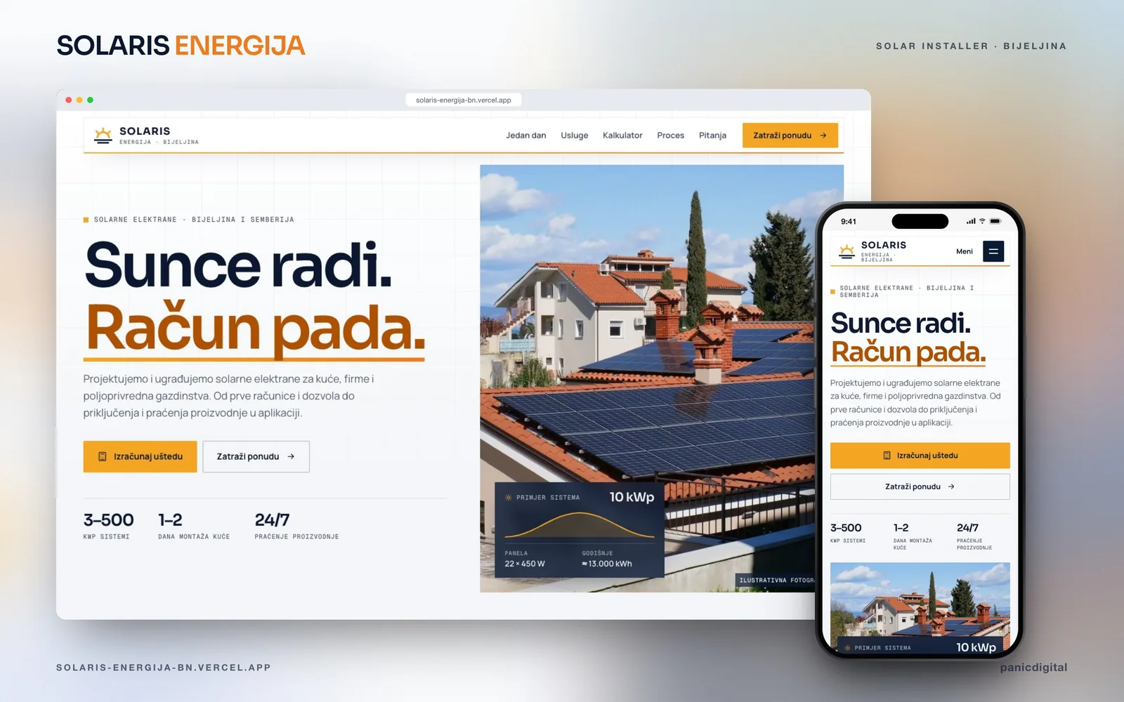
Solaris Energija Projektvorschau
Nächstes Projekt

Weiter entdecken

+

Solaris Energija

A solar-installer website for Bijeljina where one day on the roof is simulated hour by hour, from sunrise to night.

Nächste Case Study